This is post 2 of a multipart series of posts. The first part can be found here…
http://html5.litten.com/graphing-data-in-the-html5-canvas-element-part-i/
In this post we will do the following.
- Move the graph to the center of a larger canvas
- Add a meaningful background
- Add labels to the x and y axes
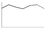
This will allow us to go from this

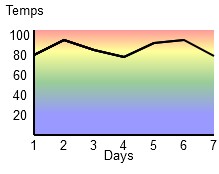
To this

This example is coded for readability and not for optimized operation. All you need is a text editor like notepad and an HTML5 friendly browser (I’m using Firefox 3.6).
<!doctype html>
<html>
<head>
<meta charset="UTF-8" />
<title>Canvas Test</title>
</head>
<body>
<section>
<div>
<canvas id="canvas" width="240" height="165">
This text is displayed if your browser
does not support HTML5 Canvas.
</canvas>
</div>

<script type="text/javascript">
var canvas;
var ctx;
var j;
var x = 0;
var y = 105;
var WIDTH = 240;
var HEIGHT = 165;
var temps = [80,95,85,78,92,95,79];
var graphWIDTH = 180;
var graphHEIGHT = 105;
var lingrad;
var padding = 30;

function drawaxes(){
ctx.strokeStyle = "black";
ctx.lineWidth = 2;
/* y axis */
ctx.beginPath();
ctx.moveTo(padding,padding);
ctx.lineTo(padding,graphHEIGHT + padding);
ctx.stroke();
/* x axis */
ctx.moveTo(padding, graphHEIGHT + padding);
ctx.lineTo(graphWIDTH + padding,graphHEIGHT + padding);
ctx.stroke();
}

function clear() {
ctx.clearRect(0, 0, WIDTH, HEIGHT);
}

function init() {
canvas = document.getElementById("canvas");
ctx = canvas.getContext("2d");
lingrad = ctx.createLinearGradient(0,30,0,graphHEIGHT + 30);
lingrad.addColorStop(0, 'red');
lingrad.addColorStop(0.2, 'yellow');
lingrad.addColorStop(.5, 'green');
lingrad.addColorStop(.8, 'blue');
draw();
}

function rect(x,y,w,h) {
ctx.beginPath();
ctx.rect(x,y,w,h);
ctx.closePath();
ctx.fill();
}

function plotdata(){
ctx.strokeStyle = "black";
ctx.beginPath();
ctx.moveTo(padding,(graphHEIGHT + padding) -(temps[0]));
j = 1;
for (var i in temps){
ctx.lineTo((j*30) + padding,(graphHEIGHT + padding) -(temps[j]));
ctx.stroke();
j++;
}
}

function addlabels(){
ctx.font = "10pt Arial";
/* y axis labels */
ctx.fillText("Temps", 2, 15);
ctx.fillText("100", 5, 40);
ctx.fillText(" 80", 5, 60);
ctx.fillText(" 60", 5, 80);
ctx.fillText(" 40", 5, 100);
ctx.fillText(" 20", 5, 120);
/* x axis labels */
ctx.fillText("Days", 100, 160);
ctx.fillText("1", 26, 150);
ctx.fillText("2", 56, 150);
ctx.fillText("3", 86, 150);
ctx.fillText("4", 116, 150);
ctx.fillText("5", 146, 150);
ctx.fillText("6", 176, 150);
ctx.fillText("7", 206, 150);
}

function draw() {
clear();
ctx.globalAlpha = 0.4;
ctx.fillStyle = lingrad;
rect(padding,padding,graphWIDTH,graphHEIGHT);
ctx.globalAlpha = 1;
ctx.fillStyle = "black";
drawaxes();
addlabels();
plotdata();
}

init();
</script>

</section>
</body>
</html>
You can copy this code and paste it into a new file called something like simplegraph2.html and when you open it with an HTML5 friendly browser like Firefox 3.6 it will display the graph.
Move the graph to the center of a larger canvas
First we make our canvas bigger. Let’s add 60 pixels to both the width and the height making the canvas 240X165. When we center our graph on it, there will be 30 pixels of blank padding all around it.
<canvas id="canvas" width="240" height="165">
This text is displayed if your browser does not support HTML5 Canvas.
</canvas>
We’ll need some more variables to help us draw our 180X105 graph in the center of our canvas.
The width of our graph
var graphWIDTH = 180;The height of the graph
var graphHEIGHT = 105;The extra space on each side of the centered graph.
var padding = 30;
In the draw() function we have a new function rect()that creates the rectangle for the background of our graph. We call this function with these variables.
rect(padding,padding,graphWIDTH,graphHEIGHT);
which in our case is the same as
rect(30,30,180,105);
Let’s look at the rect() function.
function rect(x,y,w,h) {
  ctx.beginPath();
  ctx.rect(x,y,w,h);
  ctx.closePath();
  ctx.fill();
}
We start a new path
ctx.beginPath();
Then we call the rect() method of the context.
ctx.rect(x,y,w,h);
rect(x, y, width, height)
The x and y parameters define the coordinate of the top left corner of the new rectangular path. width and height define the width and the height of the rectangle.
The top left corner is at (padding, padding) and the width and height are set to graphWIDTH and graphHEIGHT. Padding is the space around the graph.
Then we close the path
ctx.closePath();
and finally, we fill it with whatever ctx.fillStyle is set to (more on that in a moment).
ctx.fill();
Now we have a rectangle in the center of our canvas that we can draw our graph on.
We changed the drawaxes() function to draw the axes on the edges of our new rectangle and we made the lines thicker by setting the lineWidth attribute to 2.
ctx.lineWidth = 2;
/* y axis */
ctx.moveTo(padding,padding);
ctx.lineTo(padding,graphHEIGHT + padding);

/* x axis */
ctx.moveTo(padding, graphHEIGHT + padding);
ctx.lineTo(graphWIDTH + padding,graphHEIGHT + padding);
We also changed the plotdata() function to plot the data within our new rectangle.
function plotdata(){
ctx.strokeStyle = "black";
ctx.beginPath();
ctx.moveTo(padding,(graphHEIGHT + padding) -(temps[0]));
j = 1;
for (var i in temps){
ctx.lineTo((j*30) + padding,(graphHEIGHT + padding) -(temps[j]));
ctx.stroke();
j++;
}
}
We now have our graph plotted in the center of our canvas. We can use the space around the graph to draw some labels. But first let’s look at the background we are adding to the graph.
Add a meaningful background
A meaningful background for a graph is often a grid of lines that make it easy to see what the data values are. Since we are graphing temperatures, I thought that a gradient background from red (hot) to blue (cold) would be appropriate. The fillStyle attribute of the context can not only hold colors but can also hold gradients. We create a canvasGradient object and set the fillStyle attribute to that object before we call ctxFill() for our centered rectangle.
We add code to our init() function to create the canvasGradient object.
lingrad = ctx.createLinearGradient(0,30,0,graphHEIGHT + 30);
lingrad.addColorStop(0, 'red');
lingrad.addColorStop(0.2, 'yellow');
lingrad.addColorStop(.5, 'green');
lingrad.addColorStop(.8, 'blue');
The createLinearGradient() method is defined as.
createLinearGradient(x1,y1,x2,y2)
The createLinearGradient method takes four arguments representing the starting point (x1,y1) and end point (x2,y2) of the gradient.
Then we add color stops to tell the canvasGradient object what colors to use and where they are in the gradient.
addColorStop(position, color)
This method takes two arguments. The position must be a number between 0.0 and 1.0 and defines the relative position of the color in the gradient. Setting this to 0.5 for instance would place the color precisely in the middle of the gradient. The color argument must be a string representing a CSS color (ie #FFF, rgba(0,0,0,1),etc).
These color stops seem to fit the graph well.
lingrad.addColorStop(0, 'red');
lingrad.addColorStop(0.2, 'yellow');
lingrad.addColorStop(.5, 'green');
lingrad.addColorStop(.8, 'blue');
In the draw() function before we draw our centered rectangle, we set the fill style to the lingrad which is our canvasGradient object that we made. When we call the fill() method on the rectangle it fills it with our gradient.
ctx.fillStyle = lingrad;
By itself, the gradient is too bold and makes it hard to see the graph on it so we can change its transparency to make it lighter. We do this by setting the context’s globalAlpha attribute to a value between 0 and 1. In our case we set it to 0.4 before we draw our centered rectangle.
ctx.globalAlpha = 0.4;
globalAlpha = transparency value
This property applies a transparency value to all shapes drawn on the canvas. The valid range of values is from 0.0 (fully transparent) to 1.0 (fully opaque). By default, this property is set to 1.0 (fully opaque).
This makes our background visible while keeping the graph readable. After we draw the centered rectangle we set our fillStyle and globalAlpha back to normal (in our draw() function).
  ctx.globalAlpha = 1;
  ctx.fillStyle = "black";
Add labels to the x and y axes
To add labels we create an addlabels() function and call it from our draw() function.
function addlabels(){
  ctx.font = "10pt Arial";
  /* y axis labels */
  ctx.fillText("Temps", 2, 15);
  ctx.fillText("100", 5, 40);
  ctx.fillText(" 80", 5, 60);
  ctx.fillText(" 60", 5, 80);
  ctx.fillText(" 40", 5, 100);
  ctx.fillText(" 20", 5, 120);
  /* x axis labels */
  ctx.fillText("Days", 100, 160);
  ctx.fillText("1", 26, 150);
  ctx.fillText("2", 56, 150);
  ctx.fillText("3", 86, 150);
  ctx.fillText("4", 116, 150);
  ctx.fillText("5", 146, 150);
  ctx.fillText("6", 176, 150);
  ctx.fillText("7", 206, 150);
}
We set the font that we are going to use
ctx.font = "10pt Arial";
Then we use fillText to put our labels where we want them.
fillText(‘text to display’, x, y)
fillText() draws the text shape, filled using the current fillStyle. It takes three arguments: the text you want to display, and the (x,y) coordinates to define where to render it.
Now you can change the values and play with the code. Change the colors, change the data being plotted. Have fun with the code as that is the easiest way to learn.
Here is part 3 where we convert our line graph to a bar graph http://html5.litten.com/graphing-data-in-the-html5-canvas-element-part-iii/
Please leave a comment if you have any questions or corrections.
2 Replies to “Graphing Data in the HTML5 Canvas Element Part II”