This is post 3 of a multipart series of posts. All of the code to try this example for yourself is included here but much of it is explained in the previous posts. The first and second parts can be found here.
Graphing Data in the HTML5 Canvas Element Part I
Graphing Data in the HTML5 Canvas Element Part II
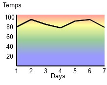
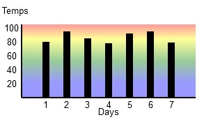
In this post we will create bars on the graph by drawing rectangles whose size and position are based on the data that we are graphing. We will also increase the size of our graph area so our bars aren’t all scrunched together.
This will allow us to go from this

To this

This example is coded for readability and not for optimized operation. All you need is a text editor like notepad and an HTML5 friendly browser (I’m using Firefox 3.6).
<!doctype html>
<html>
<head>
<meta charset="UTF-8" />
<title>Canvas Test</title>
</head>
<body>
<section>
<div>
<canvas id="canvas" width="310" height="165">
This text is displayed if your browser
does not support HTML5 Canvas.
</canvas>
</div>

<script type="text/javascript">
var canvas;
var ctx;
var j;
var WIDTH = 310;
var HEIGHT = 165;
var temps = [80,95,85,78,92,95,79];
var graphWIDTH = 250;
var graphHEIGHT = 105;
var lingrad;
var padding = 30;

function drawaxes(){
ctx.strokeStyle = "black";
ctx.lineWidth = 2;
/* y axis */
ctx.beginPath();
ctx.moveTo(padding,padding);
ctx.lineTo(padding,graphHEIGHT + padding);
ctx.stroke();
/* x axis */
ctx.moveTo(padding, graphHEIGHT + padding);
ctx.lineTo(graphWIDTH + padding,graphHEIGHT + padding);
ctx.stroke();
}

function clear() {
ctx.clearRect(0, 0, WIDTH, HEIGHT);
}

function init() {
canvas = document.getElementById("canvas");
ctx = canvas.getContext("2d");
lingrad = ctx.createLinearGradient(0,30,0,graphHEIGHT + 30);
lingrad.addColorStop(0, 'red');
lingrad.addColorStop(0.2, 'yellow');
lingrad.addColorStop(.5, 'green');
lingrad.addColorStop(.8, 'blue');
draw();
}

function rect(x,y,w,h) {
ctx.beginPath();
ctx.rect(x,y,w,h);
ctx.closePath();
ctx.fill();
}

function plotdata(){
ctx.fillStyle = "black";
j = 0;
for (var i in temps){
rect(((j+1)*30) + padding,(graphHEIGHT + padding) -(temps[j]),10,
  (temps[j]));
j++;
}
}

function addlabels(){
ctx.font = "10pt Arial";
/* y axis labels */
ctx.fillText("Temps", 2, 15);
ctx.fillText("100", 5, 40);
ctx.fillText(" 80", 5, 60);
ctx.fillText(" 60", 5, 80);
ctx.fillText(" 40", 5, 100);
ctx.fillText(" 20", 5, 120);
/* x axis labels */
ctx.fillText("Days", 140, 160);
ctx.fillText("1", 61, 150);
ctx.fillText("2", 91, 150);
ctx.fillText("3", 121, 150);
ctx.fillText("4", 152, 150);
ctx.fillText("5", 182, 150);
ctx.fillText("6", 212, 150);
ctx.fillText("7", 242, 150);
}

function draw() {
clear();
ctx.globalAlpha = 0.4;
ctx.fillStyle = lingrad;
rect(padding,padding,graphWIDTH,graphHEIGHT);
ctx.globalAlpha = 1;
ctx.fillStyle = "black";
drawaxes();
addlabels();
plotdata();
}

init();
</script>

</section>
</body>
</html>
You can copy this code and paste it into a new file called something like simplegraph3.html and when you open it with an HTML5 friendly browser like Firefox 3.6 it will display the graph.
Again our data will be 7 days of high temperatures.
| Day | Temperature |
| 1 | 80 |
| 2 | 95 |
| 3 | 75 |
| 4 | 78 |
| 5 | 92 |
| 6 | 95 |
| 7 | 79 |
We don’t need to change much in order to convert the line graph that we made in our last post to a bar graph.
First, since our bars are going to be 10 pixels wide we add 70 pixels (we are going to draw 7 bars) to our graphWIDTH variable and our canvas WIDTH variable. We also increase the width attribute of our <canvas> tag by 70.
var WIDTH = 310;
var graphWIDTH = 250;
<canvas id="canvas" width="310" height="165">
Now we need to change our plotdata() function. Here is the new version for bars.
function plotdata(){
ctx.fillStyle = "black";
j = 0;
for (var i in temps){
rect(((j+1)*30) + padding,(graphHEIGHT + padding) -(temps[j]),10,
  (temps[j]));
j++;
}
}
We set the fillstyle of our bars to ‘black’ and then we loop through our array of temperatures and use those values to create our rectangles.
rect(((j+1)*30) + padding,(graphHEIGHT + padding) -(temps[j]),10,
  (temps[j]));
We use ((j+1)*30) + padding for our x coordinate. Adding one to j moves our first bar 30 pixels from the edge of the graph. The y coordinate is determined by the temperature data. The width is hard coded to 10 pixels and the height is determined by our temperature data.
It is very easy to load an array with data from pretty much any data source. As long as the graph is big enough, you can read and graph any one dimensional data set with this technique.
One Reply to “Graphing Data in the HTML5 Canvas Element Part III”